Hutchison Inc.
Glen Hutchison came to me with humility and a quiet assurance that his company was mature, deeply rooted, and ready for elevation. He wasn’t seeking reinvention, but alignment — a visual identity shaped by steadiness, responsibility, and care. Our early conversations were unhurried and thoughtful, grounded in his respect for his team and the responsibility he carries as a leader.
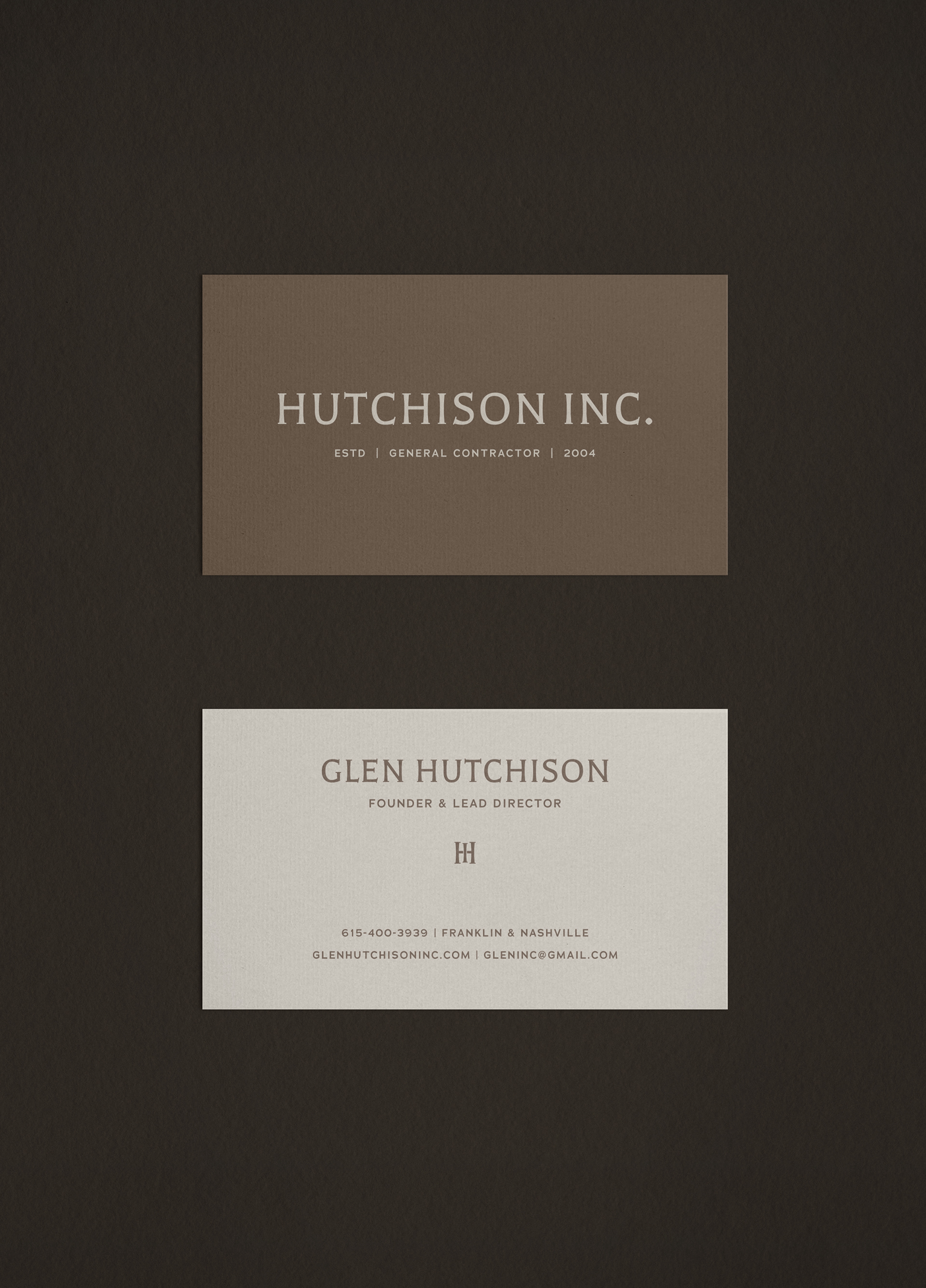
As Hutchison Inc. matured, the identity became a matter of clarity rather than reinvention.
Clarifying what had long been present, the new identity reflects restraint and a reverence for longevity over trend. Through grounded typography, thoughtful hierarchy, and a disciplined visual framework, the brand feels enduring, and confident in its established purpose.
The refined identity is guided by structure and consistency. Measured typography and restrained detail allow the name to carry its weight with clarity and quiet assurance.
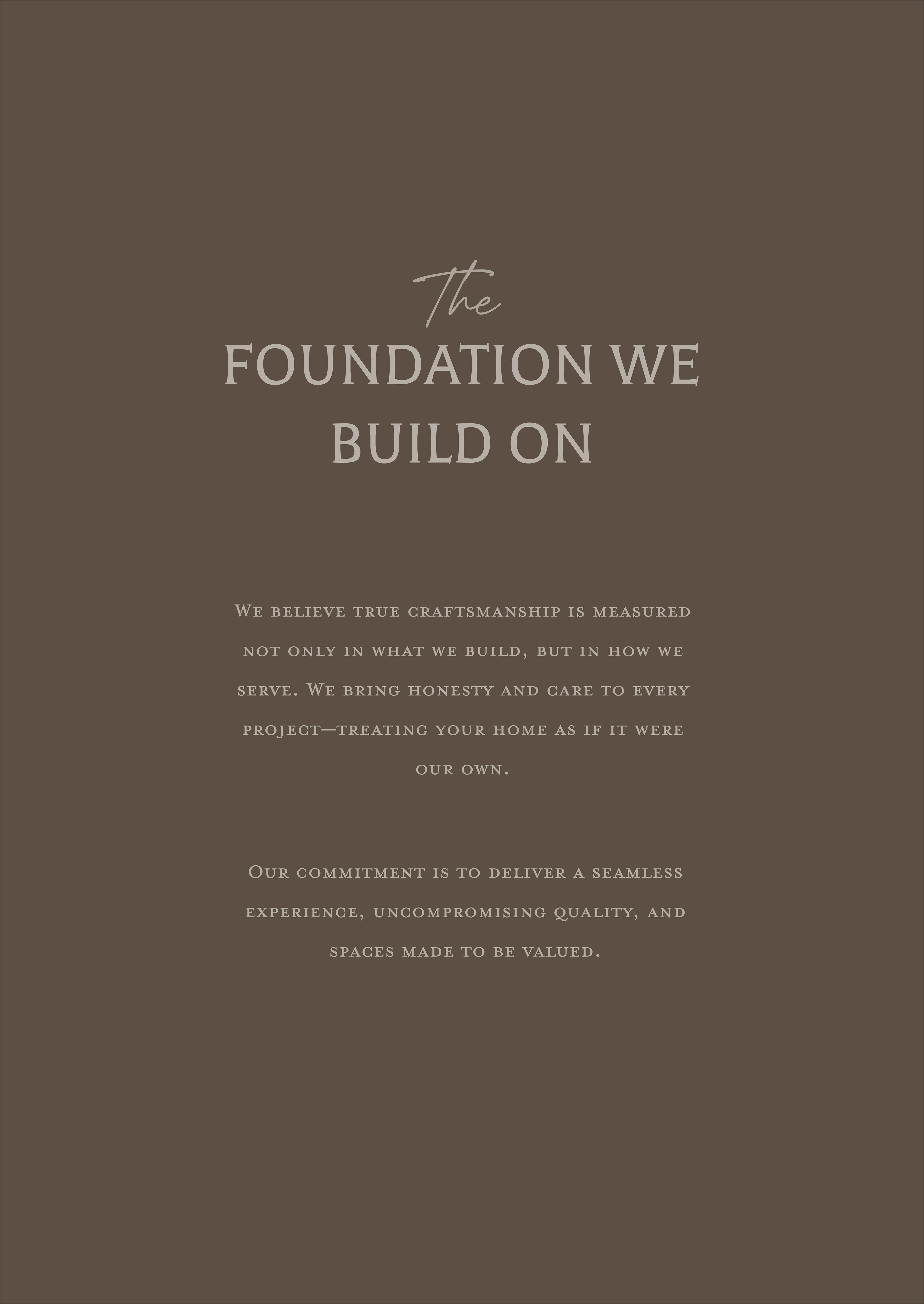
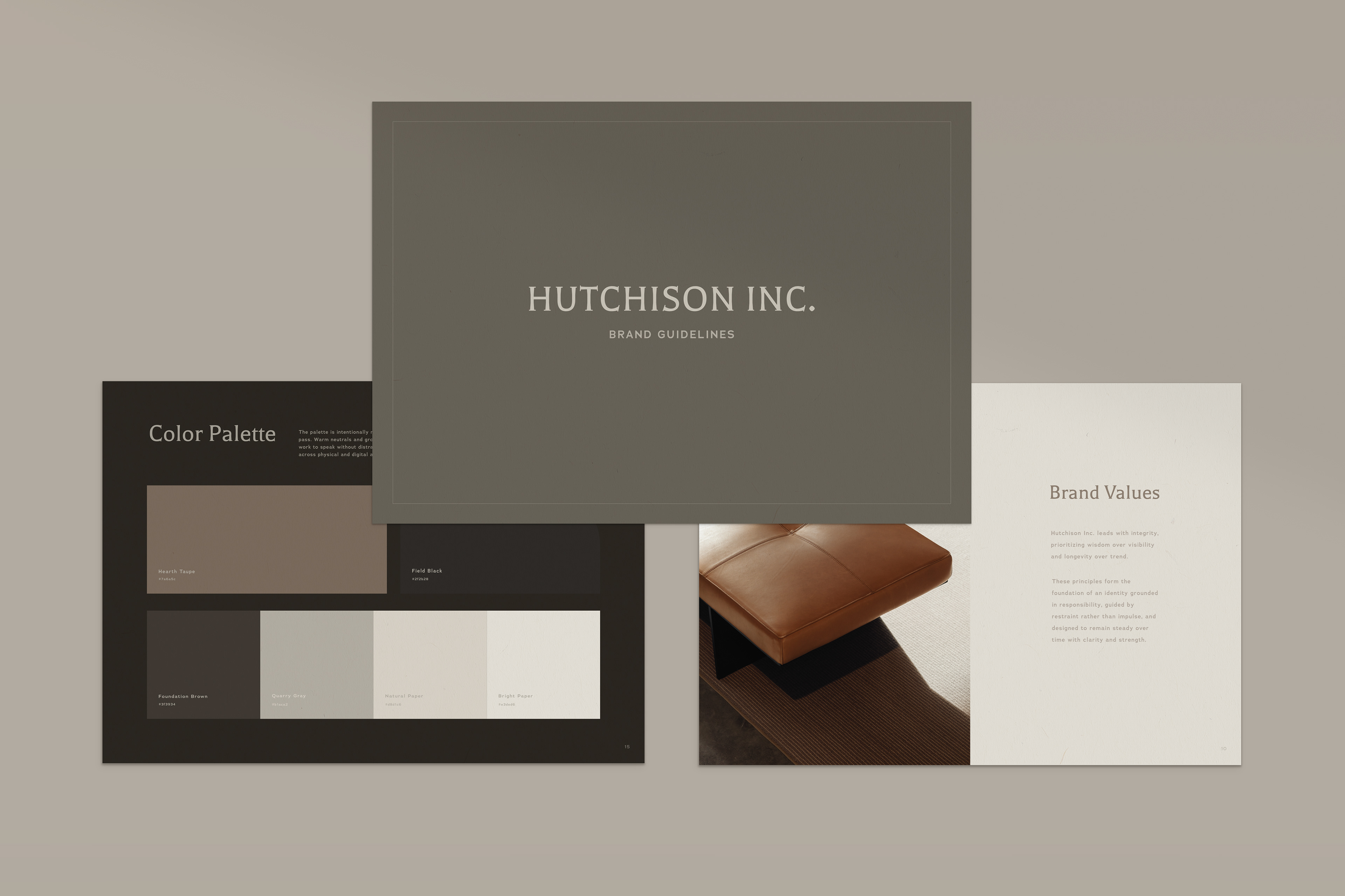
Beneath the identity is a foundation shaped by wisdom and responsibility. Hutchison Inc. has long been guided by the belief that enduring work is built with care, understanding, and patience. The identity has grown alongside the company — evolving into a system designed to support its work faithfully for years to come.

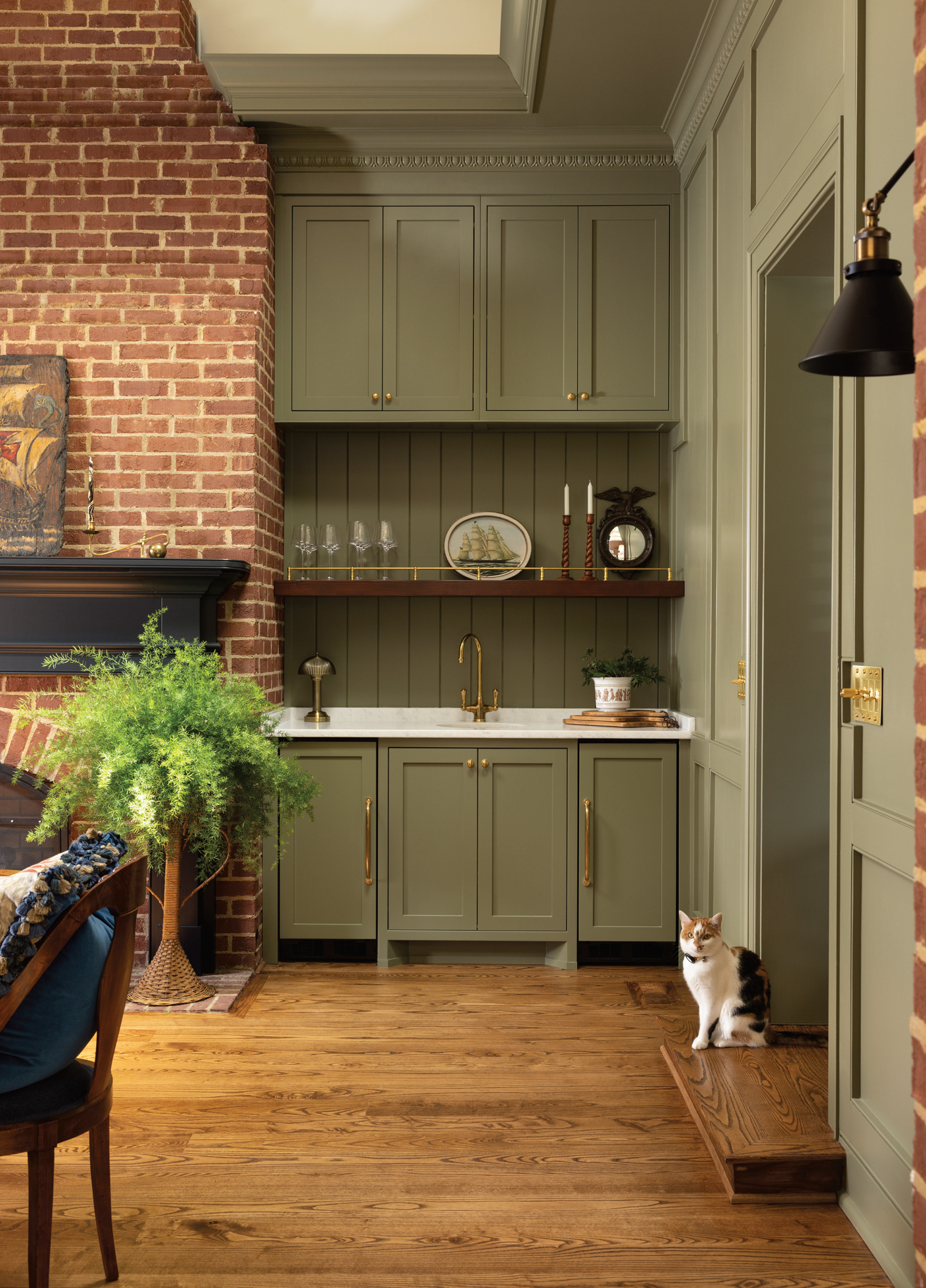
Images by Amy Lamb, NativeHouse.
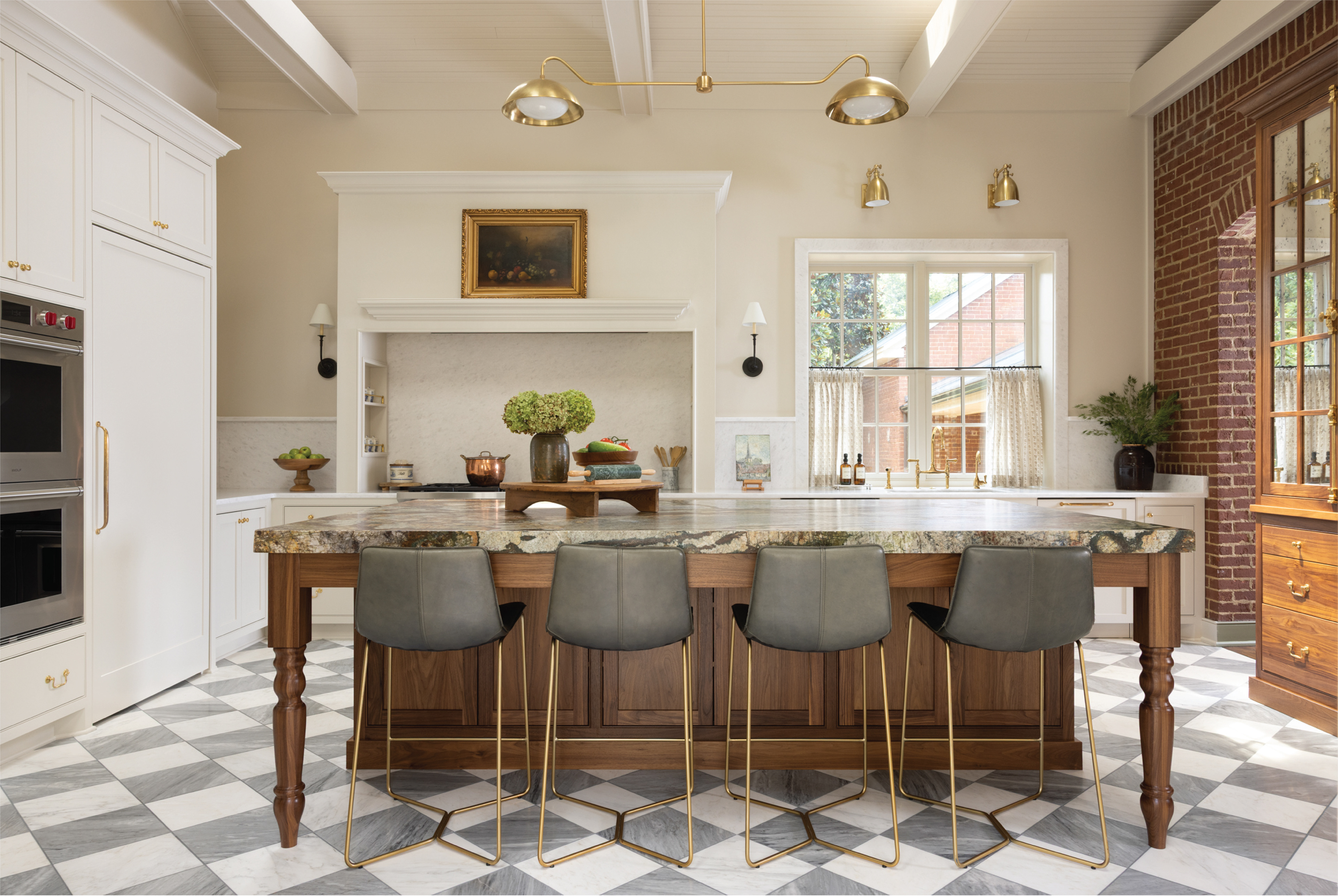
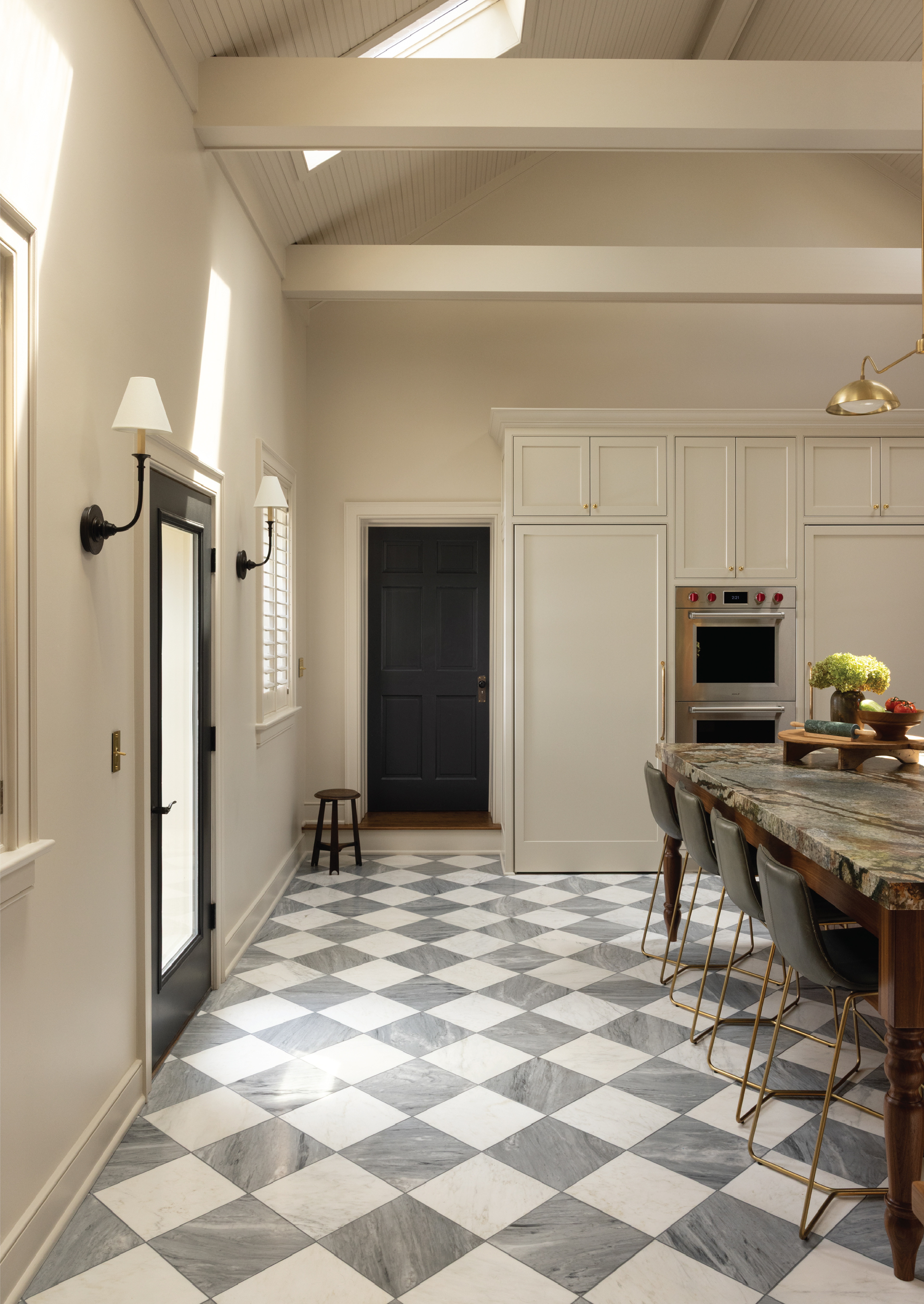
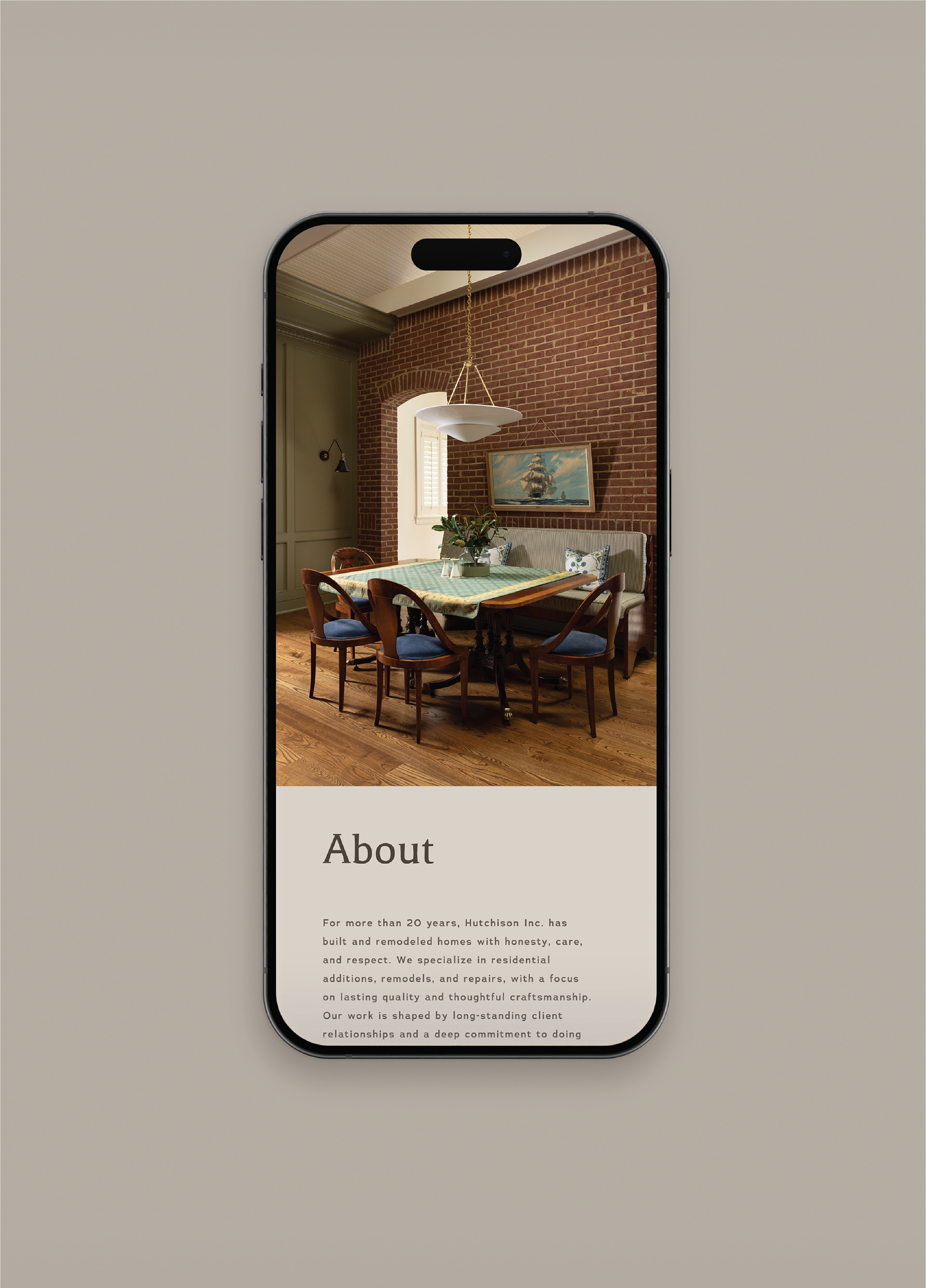
Kitchen Design by Dana Tucker.
Kitchen Design by Dana Tucker.